Tampa Bay Buccaneers New Uniform

The Bucs new uniforms are modern and flashy
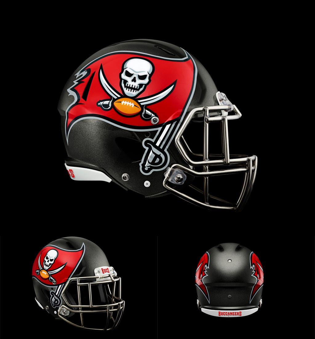
The Tampa Bay Bucs unveiled new uniforms on Monday. My first reaction was that they’re too flashy. My personal tastes are throwback style. If it were up to me, the Bucs would be sporting simple pewter pants, white or red home/away jerseys, and a pewter helmet with a plain Jolly Roger, sans the flag. There’s something about a bare, blue-collar uniform that reflects toughness. Think Monsters of the Midway. Black pants, jersey, and helmet with a lucid, white “C” adorning the side. Now that’s intimidating.
Is full-helmet festooning the way of the future?
Yet the Buc’s new uniforms are pleasing. They look modern. The two-color jerseys, with pewter-hued shoulder pad area, are unique. The huge logos on the sides of the helmet look awkward, but I think that’s the way of the future. It’s a continuation of a trend, perhaps started by Cincinnati, to embellish the entire helmet. As the years go by, expect more and more franchises to adopt full helmet festooning. It’s maladroit to look at now, but teams that stick with small helmet logos will eventually look antiquated.
I was surprised by the almost singular negative response to the new Buc uniforms by their fans. Comments by the Buccaneer supporters were nearly unanimous with their bashing of the new design. “I don’t like them…not at all…disappointed”, wrote one gal. “Agreed. Looks cheap and poorly done,” was one of the replies. “This is not good”, wrote another fan. I feel sorry for the designers that sank hours and months into the new design. C’mon, Buc Nation. Give the new uniform design a chance. It works. Let it sink in for a while.
But I do agree what many Buc supporters say about the jersey numbers. They look like they were taken straight from a digital clock. Texas Instruments called. They want their numbers back.